These projects are pillars of residential design in America - projects that are studied in architecture school and still resonate with custom home designers today. Innovative at the time, they have stood the test of time and still reflect a lot of the values people look for in their homes today. Each has a relationship to the land, takes advantage of views, and are experimental with materials and structure.
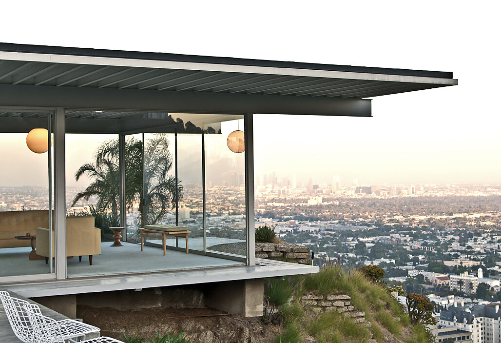
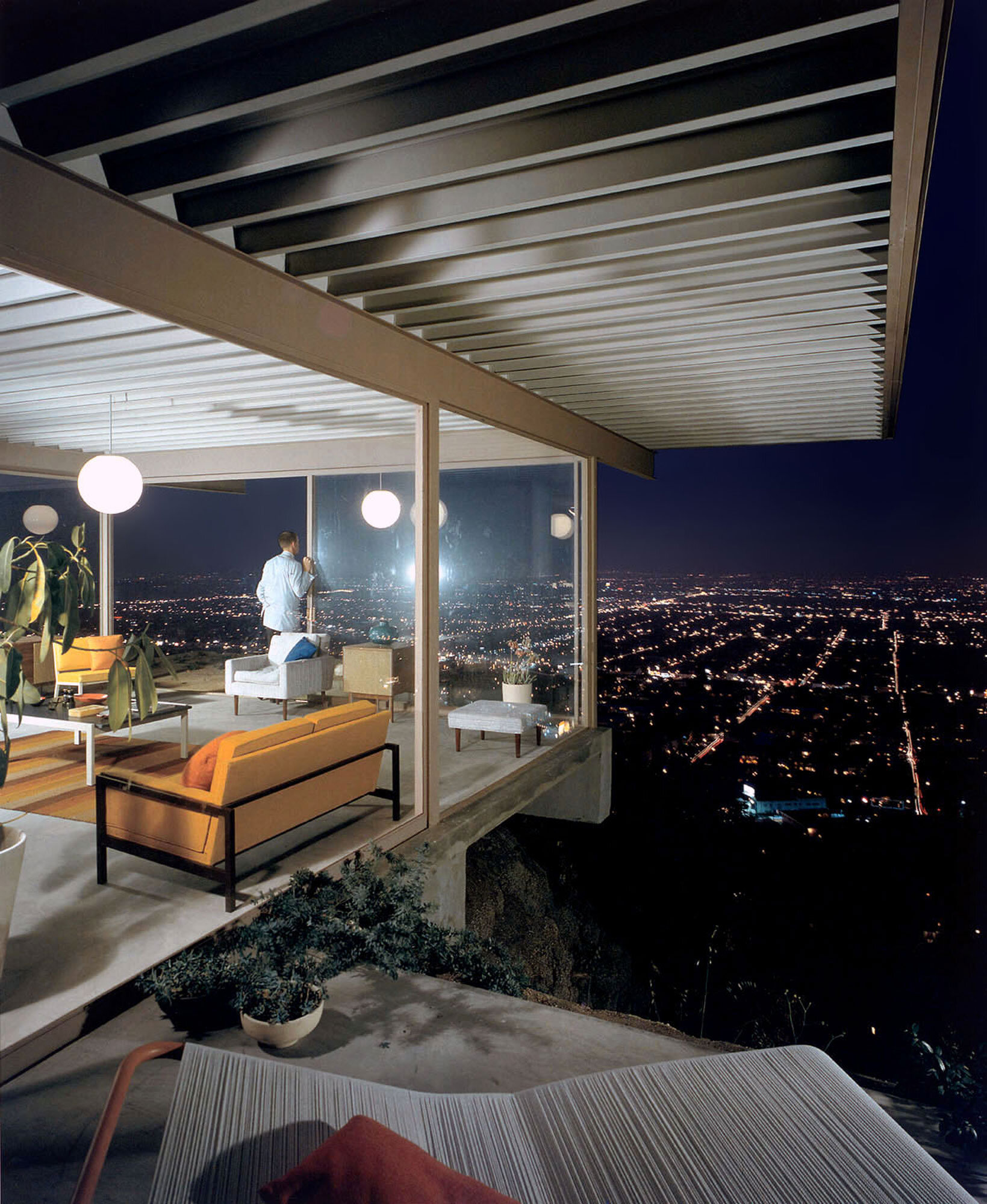
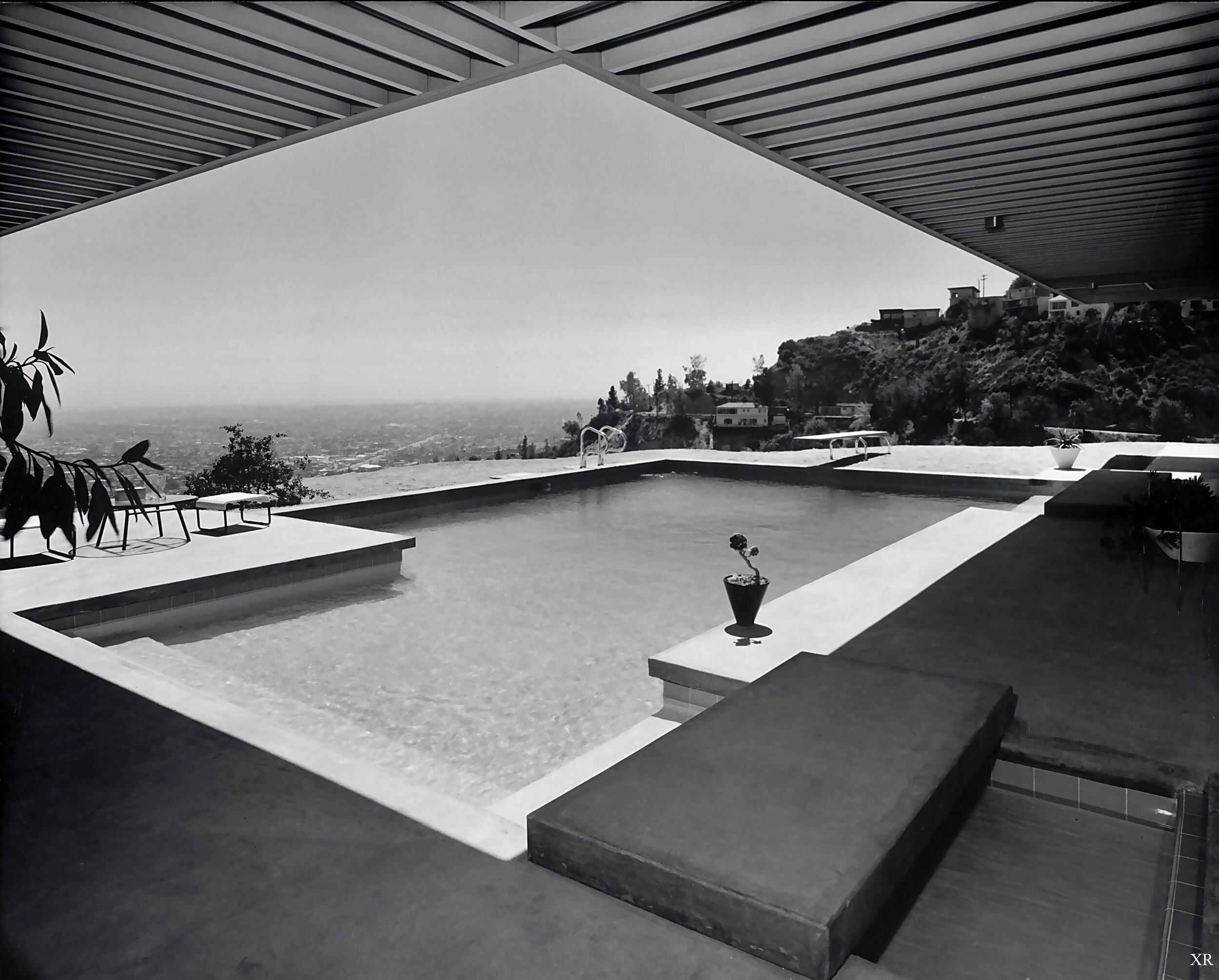
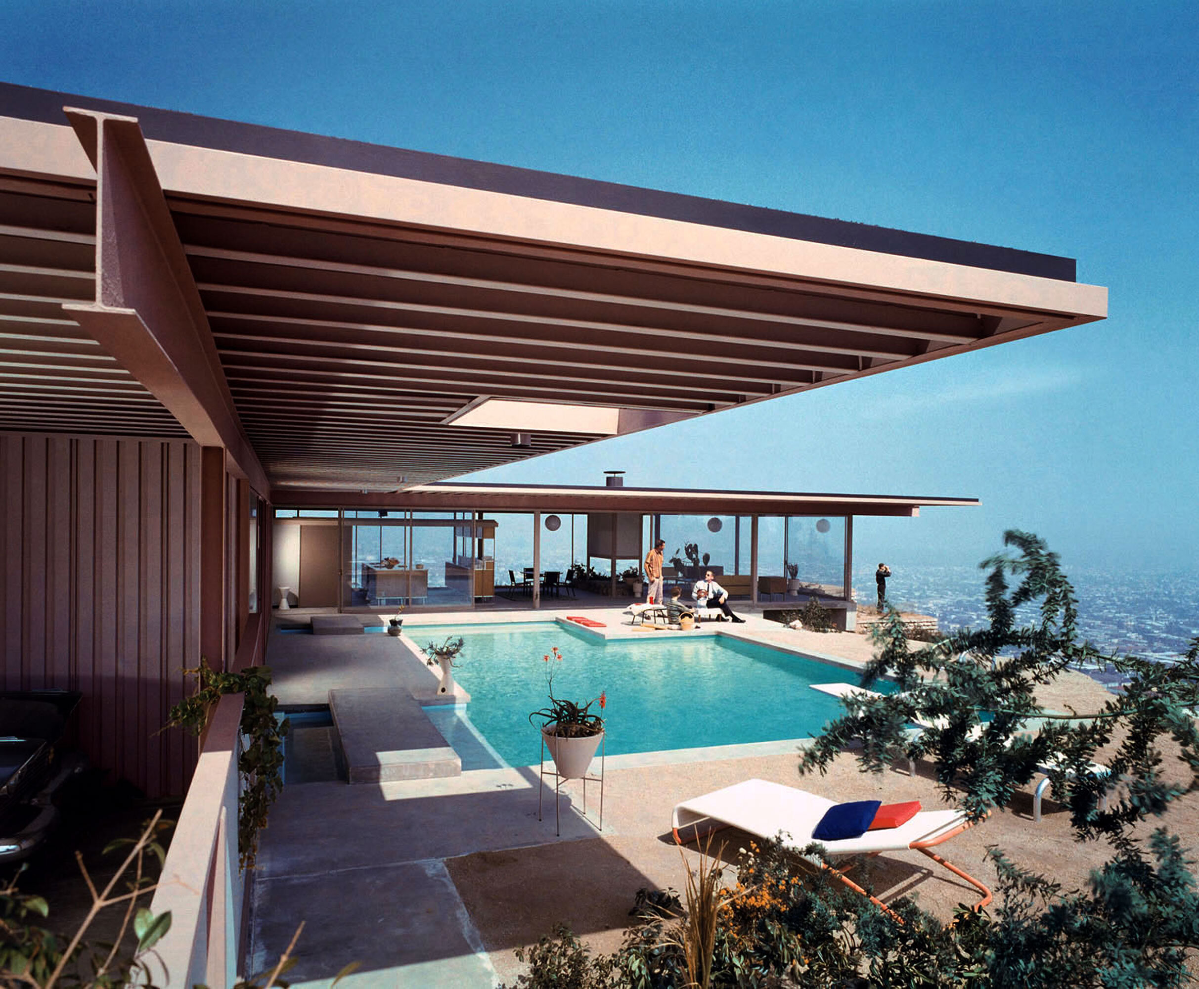
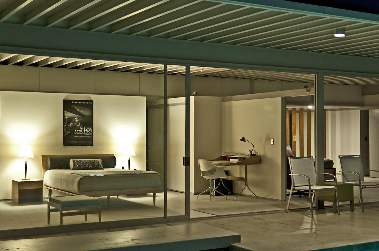
Stahl House (Case Study House No. 22) - Pierre Koenig
Where the homes I feature below are more about a connection to nature and landscape, this incredible house is all about the city. That view demanded that the architecture be open, transparent, and light on its feet. The modern aesthetic and steel structure are perfect responses to this context, giving the home a lightness that appears to float out over the city lights below. That view will never get old and the architecture is perfectly crafted to respect the drama of the site and recede into the background.
Book: The Stahl House: Case Study House #22: The Making of a Modernist Icon
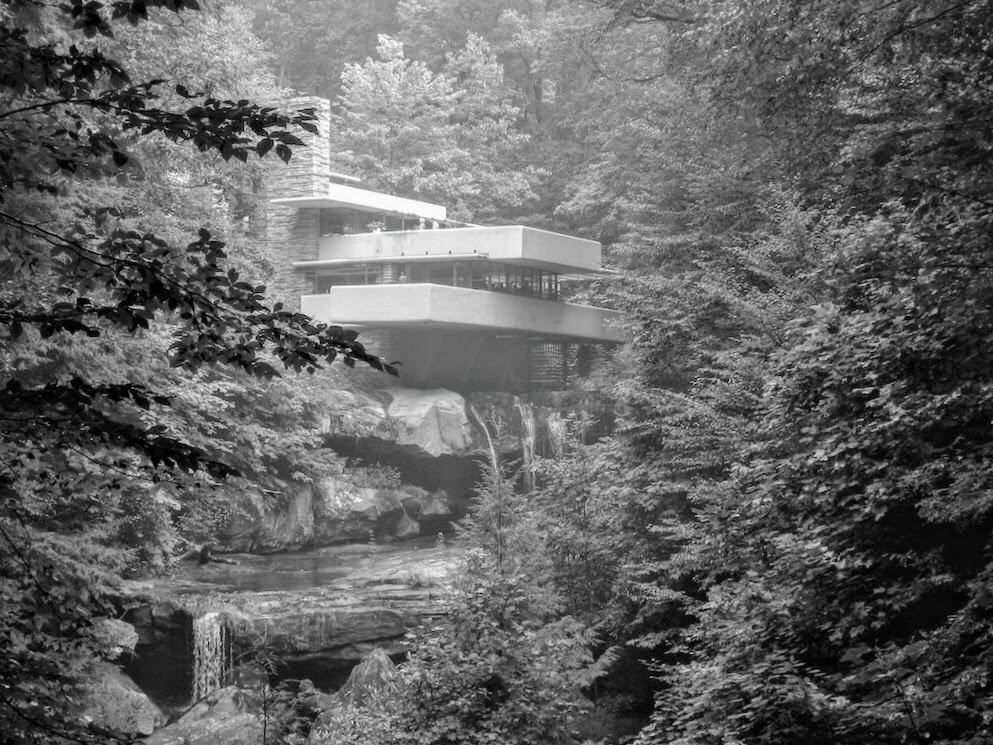
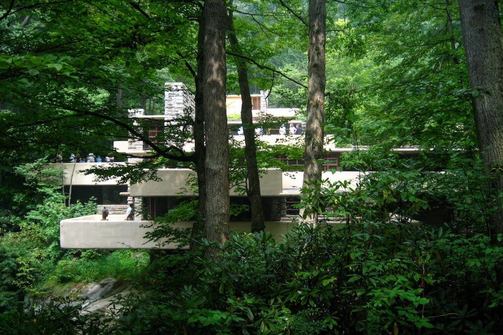
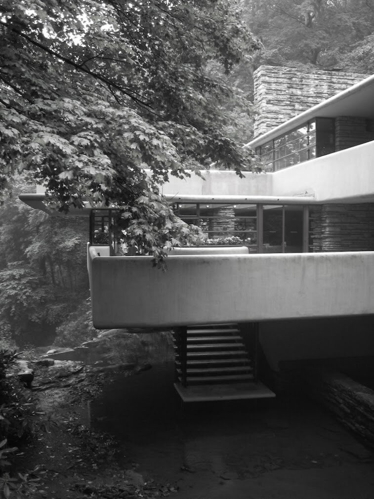
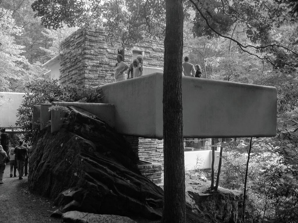
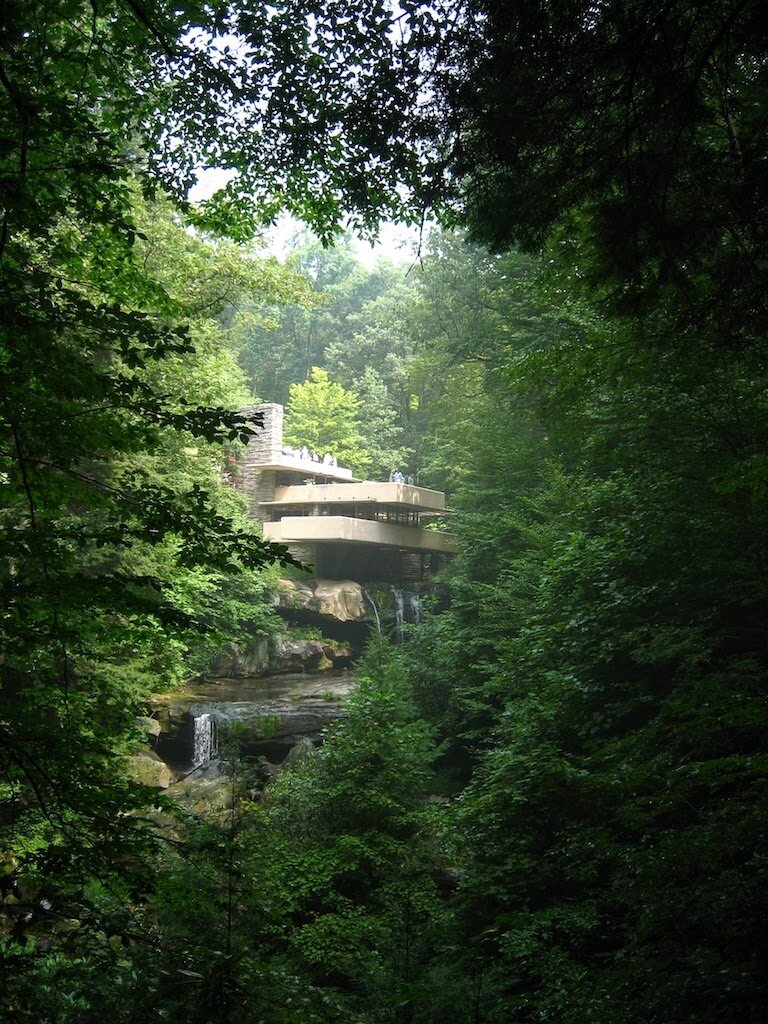
Fallingwater - Frank Lloyd Wright
I was lucky enough to visit this house back in 2006 while driving cross country to attend graduate school where I earned my Master’s of Architecture degree from the University of Oregon. I snapped the photos below on an old digital camera so please excuse the resolution and focus. I’m not sure there is a more recognized house in the world, or one that sits in a more incredible setting. Despite seeing hundreds of photos over the years, visiting Fallingwater in person was a transcendent experience. Feeling the spaces, experiencing how the home is woven into the landscape, seeing how the interior flows outdoors, demonstrates just how spectacular this design really is. These images don’t do it justice. Go visit this house in person. It will exceed your expectations.
Book: Fallingwater
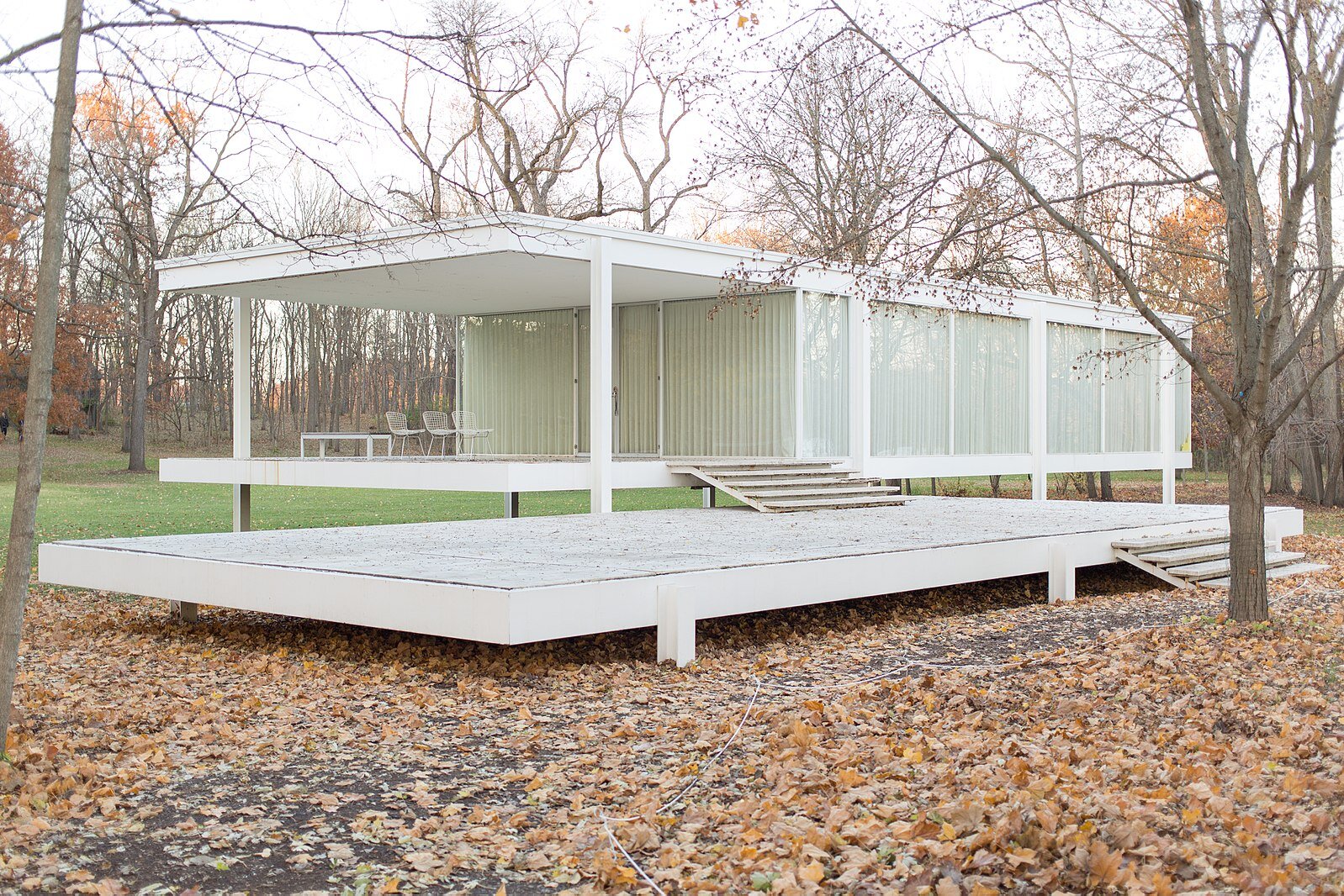
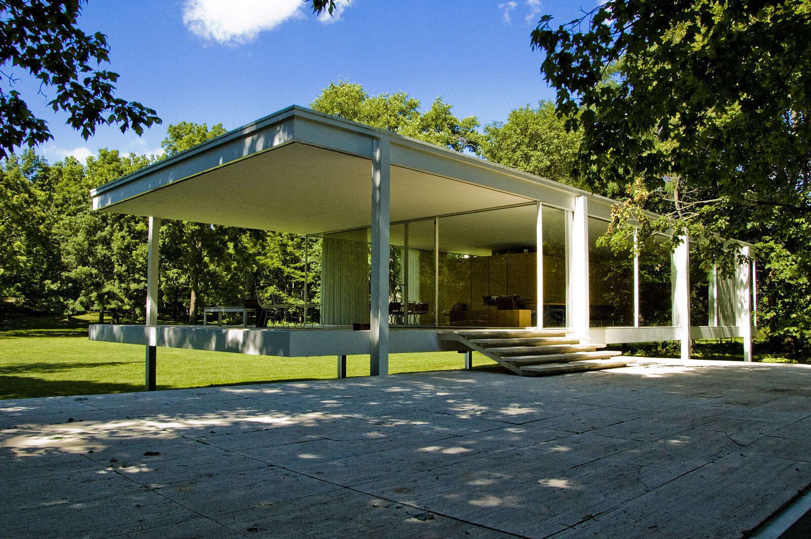
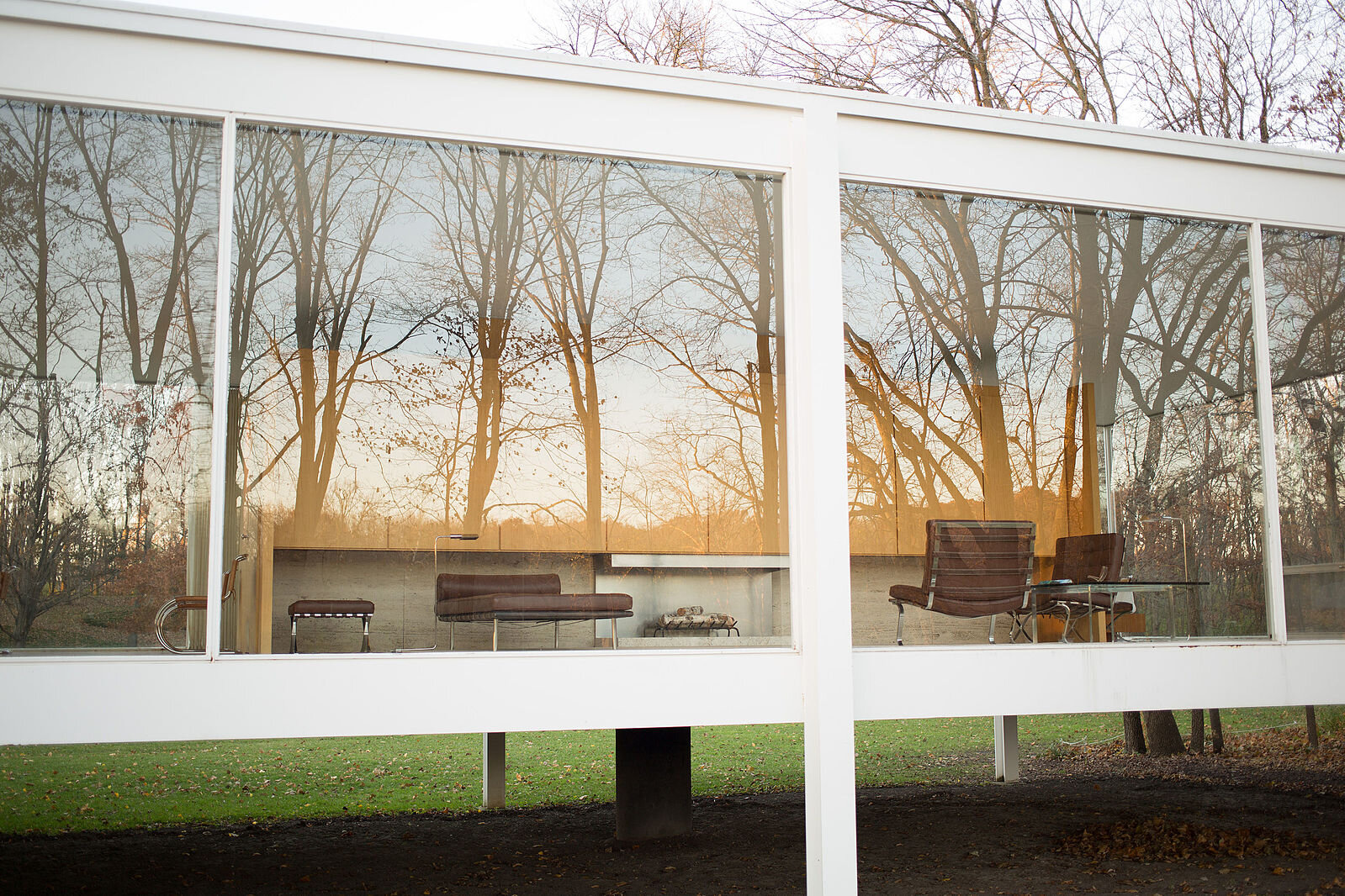
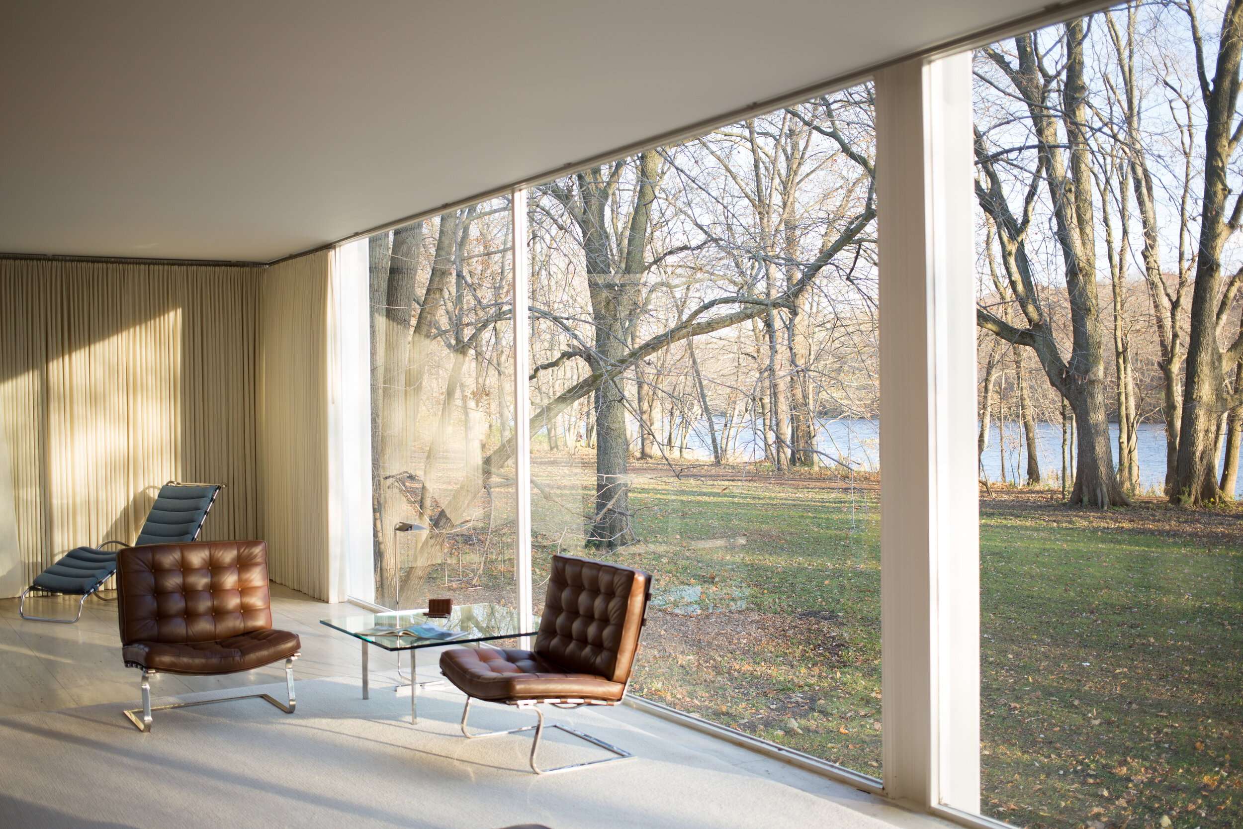
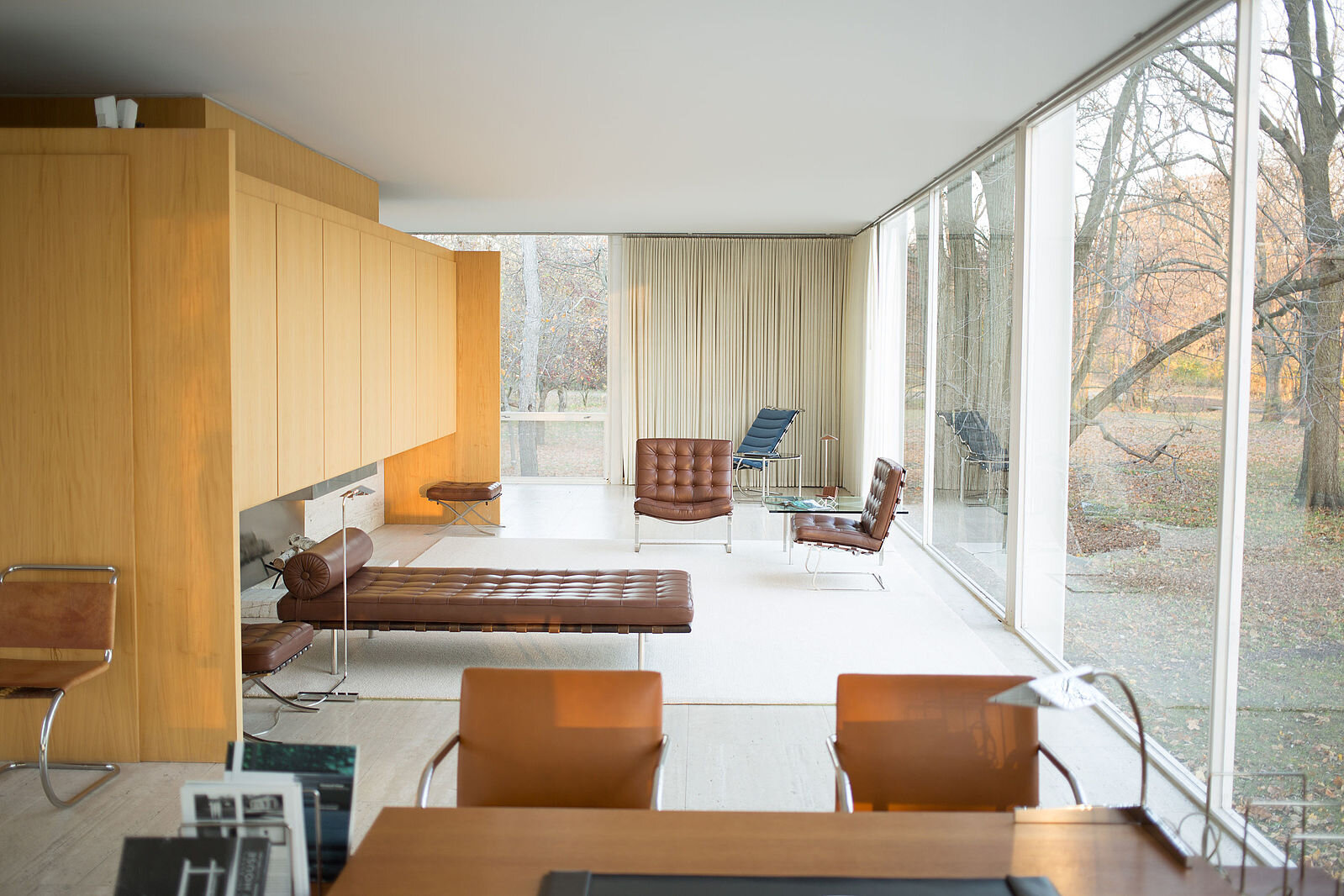
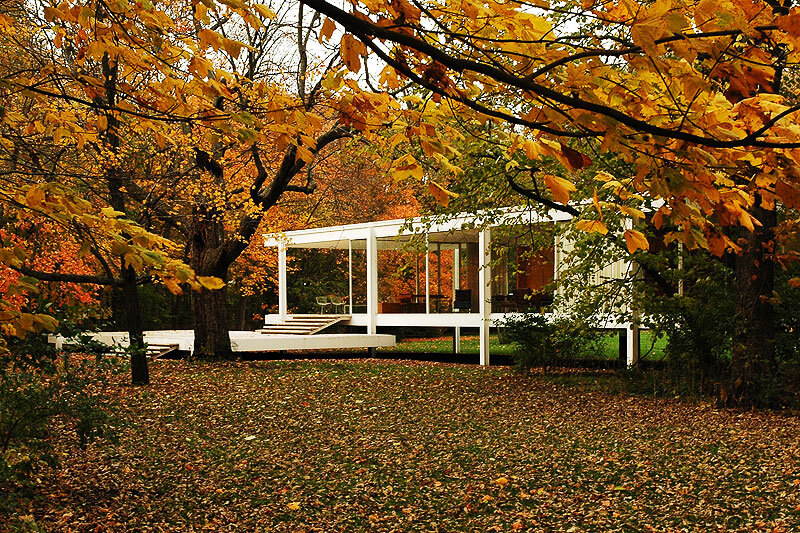
Farnsworth House - Mies Van Der Rohe
A house distilled down to the bare minimum, this design elegantly sits in the landscape while the interior is wrapped with views out over the surroundings. WIth the simple structure, slight elevation from the land, and an ultra simple form, the architect used minimalist design to compliment the beauty of nature. The interior is all about the 360 degree views out with the floor to ceiling glass walls the wrap the entire home. The spaces within are divided by the service core, meaning there are practically no walls that impeded the views of the outdoors. This may be one of the most influential houses in American architecture and reflects many of the values that I strive for in my work: touch the ground lightly, emphasize the indoor-outdoor connections, keep the form simple, use a minimal material palette.
Book: Broken Glass: Mies van der Rohe, Edith Farnsworth, and the Fight Over a Modernist Masterpiece
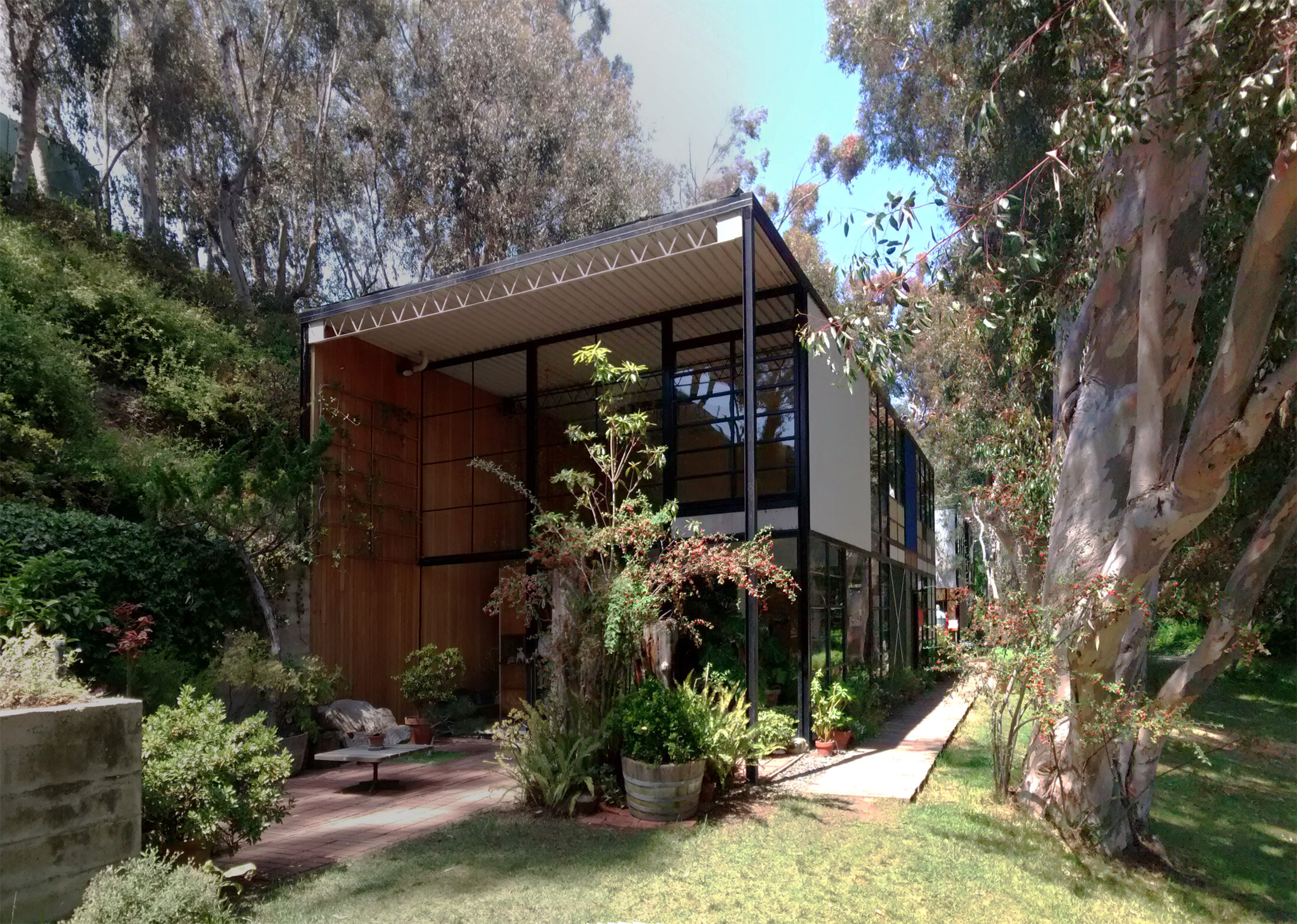
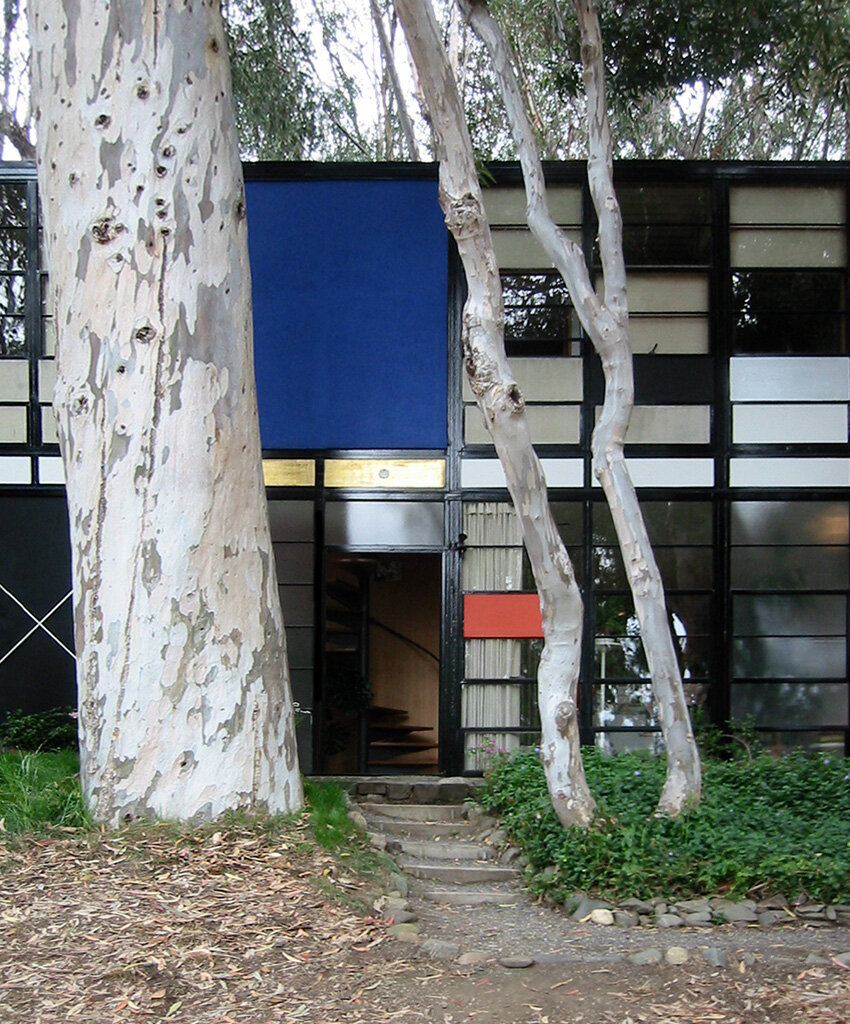
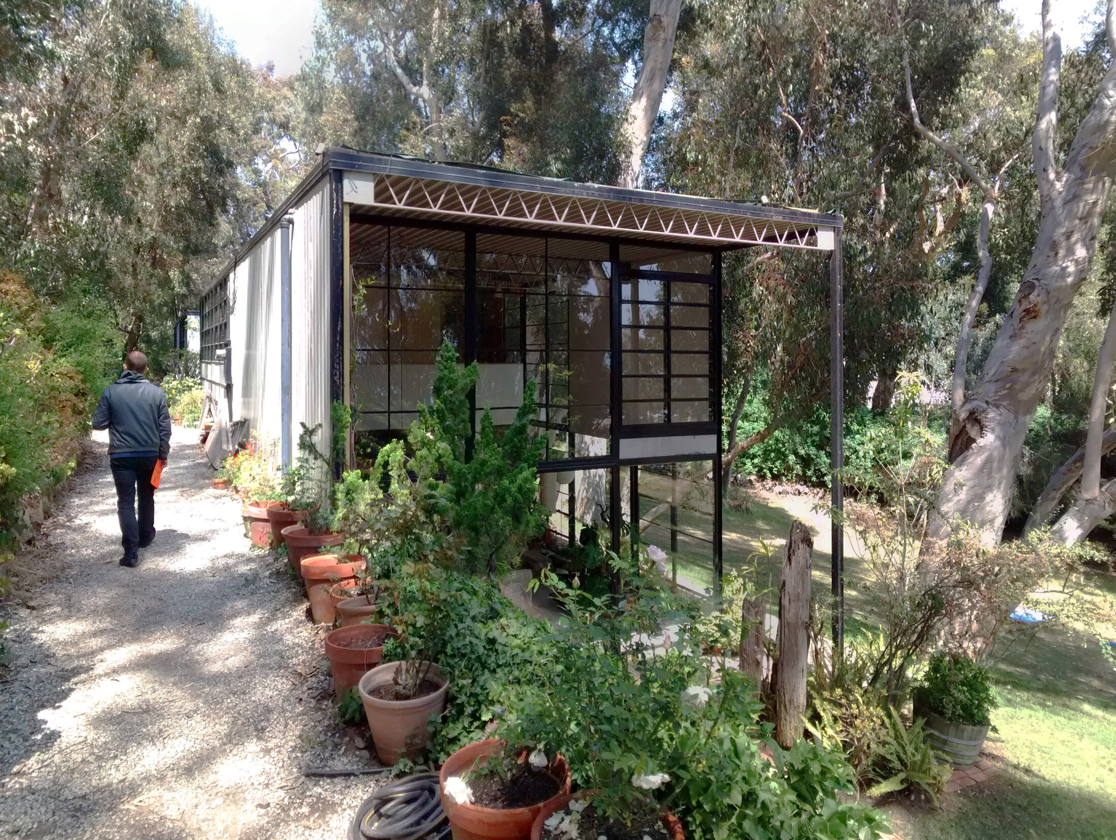
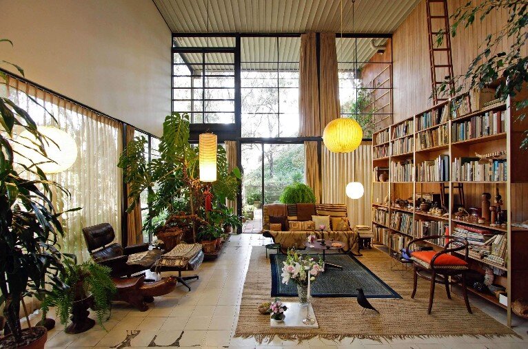
Eames House (Case Study House No. 8) - Charles and Ray Eames
The proportions, materials, prefab elements, and color composition of the exterior is what you first notice about this house. Yet more importantly is how the house sits on the site. Nestled into the hillside the house is protected on one side, while the double height facade on the other, opens up to a meadow and a grove of eucalyptus trees on the other. It is this relation to the land that makes this house what it is. Too often modern architecture is thought of imposing it’s rigid form on the surroundings. Yet the truly great homes strike a balance between their form and structure and responding to the specifics of their site. It is this sensitivity, that Charles and Ray Eames displayed in this project, that I’m inspired by.
These are some of the most famous houses in America, inspiring countless architects and designers over the decades. They celebrated new materials and construction technology. Their style was a stark departure from the more ornamental aesthetics of earlier home design. Yet, what makes me fall in love with them is how they each celebrate the natural surroundings despite their distinctly industrial material palette and structural systems. This juxtaposition both celebrates how they were built while still paying deep respect to the landscape. This combination, designing for the specific strengths of each material while crafting a response to the specifics of the land, is what I love about residential design. Working with clients that share these values, exploring each site, and working through design iterations to reveal the ideal solution is what makes design so much fun.


